Friday, 13 March 2009
Wednesday, 11 March 2009
Class Feedback
We mainly had positive feedback on;
- Good location
- Original logo
- Well defined genre
- Tension building
- Well thought out Mise-en-scene
- Well defined character profiles
- Music which fits the genre
- Effective editing, including split screen
We had mixed feedback on;
- Variety of shots
- Camera work
- Titles
We had negative feedback on;
- Too plain - Too much walking
- Unclear storyline
- Lack of Action
Our target audience had a common consensus that is was a male teen audience.
Friday, 6 March 2009
The emergency filming session first thing today was canceled, and as a result, the ending of our opening has a reworked ending, with a blur and fade to white at the end, replacing the final 3-4 scenes.
Video Filters
We are adding video filters to the titles in our piece. Most of these are custom filters from Joe's Filters, such as Joe's stylized filter, maximization and pixelisation.
Font Change
We have decided to change the font on our titles, as is was decided that it was too retro and did not keep in line with the mood of the piece
Wednesday, 4 March 2009
Shot List
During filming we used alot of different types of shot, we used alot of over the shoulder shot as we were trying to put across that we were following someone.
Also in the car park we used a panning/sweeping shot to follow someones path.
Another shot we used was a long-shot, when we filmed from the 3rd floor looking down towards the first floor.
the longest lasting shot we used was when we used the trolley, so we could get a steady shot walking through the Grafton.
Shot Locations
We, so far have only had to shoot in the Grafton Centre. In the Grafton we have shot in:
Car park
Main foyer
Food Court
We are also going to film our final scene at college.
We shot at the Grafton because we needed a place which has a quiet and secluded place, such as a car park and a busy multi-story area such as the main foyer.
Tuesday, 3 March 2009
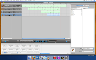
 This is a screenshot of our garageband track for our film opening. We used dark samples, and added one instrument at a time, building the track up slowly to fit in with our footage. When adding the violins every third sample was pitch shifted down to add effect and to avoid making the piece seem boring.
Monday, 2 March 2009
MONDAY 9th MARCH - 9am - EVALUATION DRAFT TO MOODLE

MONDAY 9th MARCH - 9am - EVALUATION DRAFT TO MOODLE
Evaluation Questions
The following questions must be answered in your evaluation PowerPoint:
1. In what ways does your media product use, develop or challenge forms and conventions of real media products?
2. How does your media product represent particular social groups?
3. What kind of media institution might distribute your media product and why?
4. Who would be the audience for your media product?
5. How did you attract/address your audience?
6. What have you learnt about technologies from the process of constructing the product?
7. Looking back to your preliminary task, what do you feel that you have learnt in the progression from it to the full product?
Labels: S*A*T
Tuesday, 24 February 2009
Filming
We started our filming in the Grafton centre in cambridge after getting permission to. we started off filming from the top of the escalators watching down towards the ground floor as one of the characters walked out of a passageway on the phone. Then went on to film our opening scene, where Stuart got out of the car and walked towards the the exit, and then Sam followed also on the phone, this gives the impression that someone is being followed.
the next scene we filmed was Stuart walking up the escalator which was shot in a few different ways, one of the ways was the camera going up the escalator following Stuart coming down the escalator. the final scene we shot was the following shot where we filmed stuart who just walked in front of us, then in editting we have sped it up.
Friday, 13 February 2009
Further Effect Research
We also researched the slow motion effect as a possible use in our opening. However due to the nature of the film the slow motion would not be relevant. Here is our video research.
Time Lapse Effect
For part of our opening film sequence we wanted to use a time lapse effect. We did some video research and found an example. We are going to use this effect to follow Stuart through the Grafton Centre, we thought this would be a good effect to use as it shows a long period time of time, in a very short period of time, and this would emphasise the importance of Stuart being followed.
Tuesday, 10 February 2009
Friday, 30 January 2009
Wednesday, 28 January 2009
Cast List
Briefcase Productions presents
Stanley Gibson
Samuel Kash
Michael Beforebridge
Costume Design by Samatha Green
Art Design by Kaylee Smith
Production Design by Ryan Watson
Casting by Courtney Magdalene
Film Editing by Stephen Stone
Cinematography by Samuel L. Ashman
Original Music by James Mitchell
Directed by Stuart Lowe
Produced by Stuart Lowe
Friday, 23 January 2009
Opening sequence options
For our opening sequence we had a choice between the following:
1. A supernatural thriller with a strong female lead.
We will probably not be choosing this option simply because we have no females in our group, also this would be the hardest to make a good opening about for us.
2. A British social realist drama.
We may choose this option because their has been a lot of British socialist realists drama's on television recently in which we could take pointers from and this would be a better choice than to have a supernatural thriller with a strong female lead.
3. An adventure story for younger audiences.
This would be another option we could choose because "Son of Rambo" has recently come out and would be a good film to use for tips, there are also alot of films for younger audiences around.
4. A teenage romantic comedy.
This is a option that we would not take because again we have no females in our group and this would be really difficult to make as you would most likely need an equal amount of input from both a female and male role. Also it is not a option we were really interested in.
5. A crime caper with an ensemble cast.
This is a 3rd choice we would consider. Our production logo, which was a briefcase suggests that the film that is following would have some relevance to crime or action. Another reason is we have some form of experience filming a crime based or action based scene when we did our thriller which was largely based on a criminal.
Logo Video
This is our final logo sequence which was made with edited in Final Cut, composed for Garageband and with basic image editing added in Photoshop, which we used to add the text.
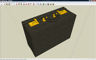
The briefcase animation was modelled in Sketchup and finalized, animated and rendered in Modo.
Labels: Steve Stone Sam Ashman Stuart Lowe James Mitchell, Video
Thursday, 22 January 2009
Briefcase.
We chose briefcase productions because it was a joke in our group and we decided to stick with it. We also chose it because we wanted to take on the challenging of having the briefcase open with our writing in it and then close again. After finishing our logo we think we have done a good job on making our idea a reality.
The 3D model was based off the briefcase used by Paul Wilson in the show The Real Hustle and also off a separate unrelated image.
Photoshop Screenshot
This is a screen shot of us using photoshop to create our draft logo. We then re-designed it to create our final piece. We took the writing from this image and used on our final piece.
In photoshop, we used different layers to create a better effect. Having a black backround with another layer containing a simple picture of an open briefcase and yet another layer containing our text. We used the select tool to select each individual letter to change the colour of them. Another technique we used was to blur the lettering to create a less sharp look.
Labels: Photoshop, Steve Stone Sam Ashman Stuart Lowe James Mitchell
Wednesday, 21 January 2009
Logo 3D Model - Sketchup

Labels: 3D animation, Steve Stone Sam Ashman Stuart Lowe James Mitchell
Tuesday, 20 January 2009
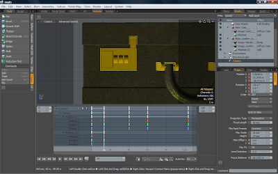
Animating and Texturing - Modo

In Modo, the final texture was applied, with the UV coordinates set up on a pair of tiled textures, I also added a bump map to the leather texture to help with the illusion of height on the texture and therefore increase the believability of the surface of the briefcase.
I had previously assigned the mesh to it's object groups in Sketchup, so therefore creating the animation was fairly simple as the objects had already been parented, allowing one object which is animated to drag all other objects on it's surface with it. The animation was fairly simple in computer terms, as it was object animation and therefore, you only needed to set the rotation or translation and the pivot point for it, for keyframes and the program would smoothly calculate the location for all frames within it and therefore fairly simple animations can be done easily. Combined with the movement of multiple objects, this means that you do not observe any one part of the animation for long and this helps with the aesthetics and makes it feel complex and smooth simultaenously.
For the final render, I used light yellow lights to give it slightly more colour and help give it a slightly warmer and less of a bland and boring feel to it. It was rendered at 720x576 with global illumination and raytraced, taking roughly 15s a frame, with the animation totally 124 frames.

Labels: 3D animation, Steve Stone Sam Ashman Stuart Lowe James Mitchell
Monday, 19 January 2009
Logo Music Score - Garageband
This is a screen shot of the Garageband music interface with our logo clip open, it shows the contents of our short logo soundtrack.
Labels: Garageband, Steve Stone Sam Ashman Stuart Lowe James Mitchell
Sunday, 18 January 2009
Logo editing - Final Cut
This is our screen shot of our final logo and music track in Final Cut. This is how we made our final piece for our opening sequence logo. The final sequence is the clips on the right of the timeline.
The final render of the 3D animation was outputted as single frames, to get these into final cut, we had to make a new sequence, and to set the default single image length to 1ms, so each frame would be played at the frame rate of the final video image and therefore smoothly as intended. This image sequence was then added to our video as a sequence. However this caused Final cut to slow down so we eventually just exported the sequence as a high quality video and then re-imported it into final cut for further editing and usage. And eventually to be played in reverse.
Labels: Final Cut editing, Steve Stone Sam Ashman Stuart Lowe James Mitchell
Wednesday, 7 January 2009
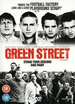
Film Opening Review: Green Street

(0:00 - 2:24)
The opening scene starts with two rival firms (west ham and tottenham) in a train station. There is no non-diagetic sounds. Only their conversation and train station backround sounds. The two rival gangs are on different sides of the tracks and are having an argument, their is alot of over the shoulder shots and quick changing shots. There are a lot of close-ups of each character during the fighting, which creates the effect of fast moving action. There are also points of view shots from the start, where a handy cam technique is also used. They also use low shots to create the effect of overpowering characters. During the fight they speed up some of the shots and put in more exagerrated sounds to create a more powerful effect. The location of the scene is an underground station in London. As a train arrives at the station, one of the firms goes onto the train and off the other to fight the other firm. One prop you notice easiest is the red phone box. A quick change of shot onto it and then back off and back to a long shot of the whole scene.
The titles in this do not appear over the scene, they appear before it starts onto a blank screen. They are just bold white letters. The characters are all pretty similar as they are just angry middle aged men looking for a "scrap". As their is no soundtrack it doesnt set a pace to the film, it also establishes itself as a realistic scene as if this does really happen. This scene referes to the football hooligan culture in england and shows how widespread it is.
We chose this opening sequence because it has lots of different kinds of shots and is fast paced scene with alot of action.
Labels: Review, Steve Stone Sam Ashman Stuart Lowe James Mitchell


